iPad – Shady – Week 12

In the theme of design, this week I had to be a companion at the hospital.  While I was there, I saw nurses scooting around computers on wheels.  The entire setup must cost thousands; big frames, bumpers, wiring, batteries, monitor cradle, etc.  The nurse goes from room to room asking patients a series of questions before surgery, and she clicks the appropriate boxes.

20150304_164043

Being in the field of IT, this interests me, and now, having been exposed to an iPad, I couldn’t help but thinking, how much easier would it be for this nurse to carry an iPad mini on her pocket.  The same software could be setup as an iOS app.  A fraction of the cost, and a simpler tool to carry.


The iPad as a Global Broadcasting Tool

image

One of the main ways my use of the iPad has evolved thanks to CDT 450 is that my mind is beginning to develop a deeper understanding of the iPad as a MOBILE GLOBAL BROADCASTING TOOL, and the implications for education in general. I can read, take notes, sketch, record video, audio, research, etc. I’ve been doing that for years – But now I’m thinking more about how the iPad can help me to communicate and share my creations, ideas, and discoveries with a global audience – especially when I create something compelling enough to grab and maintain people’s attention.

For me some of my most productive learning comes through interacting with other students and experts. I know that my understanding is increased when I am required to create something related to course material and present it, or creatively share it online. As I mentioned above, I’m learning new ways to do this throughout my learning experience, from collaborating online, to presenting to a group.

Weekly iPad Reflection Chris W

After almost a full semester of occupying the iPad, I don’t know how I am going to live without this thing.  All my assignments and a majority of my internet browsing are done using the iPad.

Stony brook University uses a website called Blackboard to distribute assignments, post grades and weekly reminders, and have the students interact with one another. I navigate blackboard exclusively form my iPad. The layout is nicer. The design is nicer. Everything is nicer on the app end of Blackboard.

Screen Shot 2015-04-21 at 1.08.15 PM
Screen Shot 2015-04-21 at 1.11.48 PM

Web version of Blackboard

image
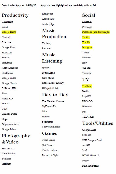
App version of Blackboard

The main difference between the two is the active panel the app version has. It is easy to navigate the different tabs as well as see exactly where you are.

Oh Back Button, I Hearken Ye

It’s been a while since I posted an update on what apps I currently have on my iPad. I’ve definitely increased the number of them that I use. Only the highlighted ones are used without fail every day, but I will definitely say that I still use most of them on a weekly if not every other day basis. I have now used the iPad for about three months, and have finally gotten used to not having a keyboard. Granted, I could never imagine writing a paper without a dedicated one. Other than that, I have noticed that I am much more productive throughout the day–I always have access to materials and tools for each of my classes.

I still want a back button. You think I’m joking, but I’m not. There are so many apps that you cannot simply go back one step; you must completely start over.

Apps As of 4_20_15

Technically Yours,

R.

P.S. I assure you that the game “8bit Doves” says exactly that. Image compression is a bit dirty..


Blogs Aren’t Better Than Journal Assignments. They’re Just Different

I’m curious what you think … does writing here in public make you write differently than when you write privately?

With all the hype about blogging, Mr. Foster decided to give it a try in an introduction-to-sociology course he was teaching. He was surprised to find that the quality of the students’ writing was better than what he’d seen in private journals he’d graded as a teaching assistant in another intro course.

via Blogs Aren’t Better Than Journal Assignments. They’re Just Different.

Week 12: Design Challenges and Research

We may have a visitor in class this week … Eric Kunz, developer of LiveBlend.

I’m impressed by your Design Challenges and how far you’ve come in a week. Let’s review:

Slides for today are here. Let’s start by writing your Design Challenges back on the board. Using your sticky notes expand a bit on the things you know and don’t know and update your team’s post from last week.

I will ask you to work through your research questions and methods to be ready to come to class next week to start thinking about creating your app experience.

  • Read pages 79-109 of the Design Kit
  • iPad Reflection: Due 5 PM on 4/2/2015
  • Team Post … see instructions below: Due 10 PM on 4/22/2015

Screen Shot 2015-04-16 at 2.30.14 PM

Right Shark Design Challenge for "Critique"

Challenge: Design a mobile app that supports peer critiquing using gamification elements.

Restated from original: “How can we create a mobile environment that supports peer review and feedback through gamification?”

Process: This challenge was chosen after carefully evaluating the positive and negative attributes of each of the suggested challenges made by team members. Our evaluation included the following discussion:

What stood out about each idea?
Kate’s idea is good for faculty and students.
Chris’s idea is simple.
Ken’s idea seems like something people could use a lot, and use to make some income in an unstructured and unstressed way. It’s like Cuddle for the whole campus.
Shady’s idea has a lot of potential for presenting information visually through maps and reports, and create serendipity through GPS and potential for online discussion around events.

Are there patterns or areas of overlap?
Kate’s and Ken’s ideas could be somewhat combined for critiques and collaboration in the same app.

Are there areas of multiple interest in the ideas?
Kate’s idea could potentially be used as a portfolio site or for networking.

Strengths, weaknesses, needs, constraints.
Shady – mapping multiple events in the same building could get cumbersome
Chris – app doesn’t really do that much

Identify who each idea is for (audience)
Kate – faculty, artists, art students, possibly app developers and other students.
Ken – students, faculty working on projects
Chris – students
Shady – students, campus clubs, administration

Are the ideas focused on solving their problems?
Yes, each one will work to resolve specific problems for the intended audience.

What we know about the challenge we chose:

Students can benefit from feedback on their work
Gamification can be effective in incentivizing behavior

What we don’t know:
What methods of gamification can work for this application. Since it’s similar to Quora, we can perhaps analyze their methods.

What are the limits to the types of projects that can be critiqued?

Research Questions and Methods:
How can this be built as an app, from a technical perspective (i.e. what language or platform(s) to be used)
How can this be marketed?
What’s the budget?
What’s the target audience?

How is it supported?

Will the audience be willing to integrate it into their work flow?

Kate's Weekly Create

Reese & Roxie
This week’s create involved using the Slate app to tell a story. Since I used slate last week, I wanted to try something different from what I usually do and though I had several ideas that I will be trying on my own time, I decided it would be interesting to see how slate could be used by students to help the community. I volunteer at a local animal rescue center and wanted to use the platform to feature the story of their adoptable pets. After visiting the dogs, hearing their background, and making a few paintings for a personal touch, this app is fantastic for quickly putting together a finished product and I could see this being very useful for student work. I was able to produce everything including the watercolors on the go which was really helpful. My only issue with the app is that though I love the one option that allows you to have the window move over the image, it’s height depends on the screen dimensions which is not always obvious if you are doing it on the iPad. This may make the content not look right on all devices or orientations. I would love a bit more flexibility.