This week I tried my hand at Adobe Slate. Here is what I made. The Adobe Slate interface is super easy. No need to know any html, JavaScript, or CSS to make a beautiful functioning website
This week I tried my hand at Adobe Slate. Here is what I made. The Adobe Slate interface is super easy. No need to know any html, JavaScript, or CSS to make a beautiful functioning website
Since installing and implementing slack, I’ve been looking for an integratabtle task management extension for slack. I want to be able to nest tasks under larger tasks and have progress reporting and a visual representation of statistics related to the progress/users. This would serve anyone who wants the ability to digitize delegation.
One app that would interesting to see in higher education is an app that shows students how much of their tuition is being wasted if they skip a class or something similar to that. This app’s purpose is to show students the dangers and costs of procrastination. If the students want it could give tips on better ways to allocate their time. The content would be clever and humorous. I’d like to call it CrnchTime.
(Late post because I need CrnchTime too)
My app idea is an online marketplace, basically like Fiverr or oDesk but specific to Stony Brook. People could do small freelance jobs for each other in exchange for credits, which they can cash out or spend on hiring people to do jobs for them. Some examples might be designing a resume site for someone or making a logo for their app. I imagine many departments could use this a lot, for instance if the music department needs a programmer or the computer science department needs an artist. Basically it would create a market for trade within the campus.
I feel that limiting it to the campus would increase the quality of work over other online freelance marketplaces, and offer a greater degree of accountability since you might know somebody who knows the person hiring you. It could be integrated with Facebook, LinkedIn, and Yammer to use already existing social connections, allowing you to vouch for someone or find a friend of a friend with the skills you need. It would also provide an opportunity for networking or friendship among students by working on each other’s projects, and experience delegating parts of their own projects.
I created this slate document to provide my response to how I define design. I included some simple ideas I had about qualities usually investigated in the design process along with examples of how my illustrations utilize design.
As an undergraduate I enjoyed studying both art and science. When I look back on what could be added to the iPad that could have enriched my experience I have a few ideas. Two of them center around studying art at a university that is focused on science.
The first would be an app that puts researchers and students/artists in touch with each other allowing students more opportunities to see what is going on in the community as well as correspond and get feedback from researchers and have a greater exchange of ideas. Something that is like a hybrid of yammer, LinkedIn, and possibly something else entirely.
My second and more developed idea is an app called “critiQue”. I recently had the opportunity to participate as a reviewer in an art show for students about ready to graduate high school and enter college most likely to pursue arts. For many of them it was the first time someone other than their teacher, friends, and family had given them feedback. This made me reflect on my experiences and what could be done to help students broaden their ability to receive crucial feedback. One thing I would have like to see would be a social media app that allows others to critique your work and provide you with constructive criticism. Though the critiquing process is sometimes harsh there is no better way to develop your work than by hearing criticism from others. For students especially those at a university like Stony Brook there would be many benefits to this type of app. Most apps are geared to social posting and comments are often from people outside the field who either “like” it or have some other generic “it’s pretty” comment that does not add any valuable discourse. While it is nice to hear people like your work, it does not help someone improve their work. Why is it good or bad? Why do you like it? How could I improve? These are all questions that are asked in isolated classrooms. Why not take this to the larger student artist community rather than waiting for the slim chance of an exhibition where you might have your work displayed and may get a few helpful comments ? It is very important to be able to see your work against the larger community discussion taking place in art across this campus as well as other campuses. In such an app, you could post your work in progress and hear feed back from other art students, faculty and professionals. Constructive comments could be rated to show which ones are most valuable and how many people agree. The initial amount of works you may share would be a small standard amount but would increase as you give feedback to others fostering a discussion between students.
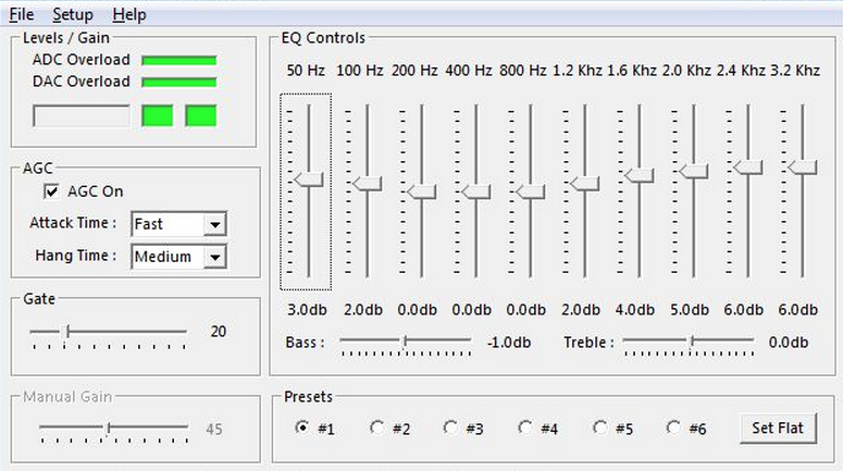
I would like to have more control over the sound that my iPad (re)produces. While I’m listening to music I like to have some control over the low, mid, and high frequency mix. It would be great to have access to an equalizer that I could adjust, depending on the audio that I was listening to. Since there is such a wide range of audio quality on the www, it makes sense to me that the iPad would give the user the ability to make adjustments to improve the listening experience, including a general “signal boost” slider for uploaded audio that is hard to hear, due to low recording levels. I know this used to be a standard feature for windows – unfortunately, I think it’s always been missing on Mac.
When I think of [design] I imagine a process of exploring and experimenting with an open mind, guided by a specific purpose; problem solving and artistic expression intertwine to create a product that is useful and aesthetically pleasing.
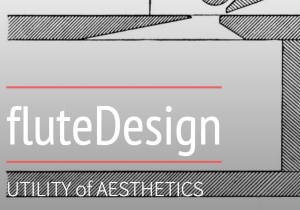
Click on the image to see a brief “Slate Presentation” on the roles of 3D printing in the design process of wind instruments that I create.
With all of this newfangled technology that’s being offered to us as students in 2015, there sometimes seems to be a disconnect between what’s helpful or good to use and how quickly we can actually use it. It’s 2015 so there’s no reason to not immediately reply to a text (even at 4:36 am), no reason I should not immediately know an answer in class, no reason I shouldn’t have an immediate comeback to someone else’s wit, and no reason I should have to wait on a table at 7 pm on a Friday night at T.G.I. FRiDAY’S. You know I’m joking, but people often forget to take a moment to breathe and realize that not everything has to be so immediate–if you’re shooting for a comeback, that’s another story. Funny is as funny does after all.
One thing that can be sped up, however, is productivity on mobile devices. Mobile apps were created in part to make things faster for the consumer. For students in particular, Google Apps for Education has been a great addition to our productivity toolkits. The problem with using them on a mobile device is that they’re often limited versions of the actual programs. Another issue (even when on desktops), is that the user has to create a project in one program, save, export, and maybe be able to upload it into another program for further edits. I propose a Course Management Software not completely unlike Blackboard or Moodle, but one that is based on Google Apps for Education.
This app would have all the general functionality of another CMS, but is set apart by the affordances of Google. When a professor uploads a PDF of a reading, I would be able to open and annotate without saving it to my device and opening in another app. I would be able to record my lectures and tag them appropriately for followup. One of the best parts about a Google-based CMS is the data creation portion. Instead of having all the Google Apps as part of separate programs, they would all appear on one main screen as a “toolbar selector.” For instance, I begin a new document and type out what I want to say (Docs toolbar), then I want to add a nice visual so I click on the LucidCharts toolbar option and immediately my toolbox items change, but my document remains. When finished with the document, I would have the option of saving in a variety of formats (depending on what media I used to create my project).
As a student that has been using an iPad for a few months now, I feel that I can adequately navigate through iOS quickly and efficiently. That being said, I often am just waiting on my apps to swap over (or to figure out how to export and reopen elsewhere). With a fully integrated app, I can probably save an entire 2 minutes a day. It may not seem like much, but over four years of education that’s almost 11 hours of time that can be spent elsewhere–quite possibly used to make even better work.
DO NOT PRESS
DO NOT PRESS
We’ve probably all seen something similar to this online. The infamous Big Red Button that we are not allowed to press. I think that it is a great example of design. Why, you say? I’ll tell you. What is the first thing that you want to do when you see it? Press it! This object, is not only recognizable, but it implores you to use it without overtly saying to do so. You think that it is of your own will that you’re pressing the button–in fact, it must be your own choosing because the button said don’t press it.
For those visually inclined peeps, the contrast of smooth-edged red, and seemingly rough-edged white balance each other out. If you’re still not sure if this design is up to par in terms of artistic content because I made it in Microsoft Paint, I know of a great nation on the other side of the world that might help you decide.
Let me know what you choose. In the meantime, I’ve got a button to go press.
Technically Yours,
R.