Group: Julia Liu, Ann Rayburn, Wren McMillan
Painting by Wren
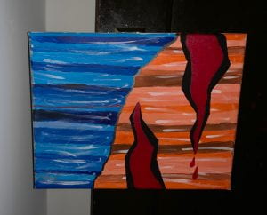
This untitled painting strives to visually represent a gruesome battle between the Virtues and the Vices in Prudentius’s Psychomachia. This battle, fought for the control of the human soul, is fraught with blood, gore, and the desecration of the body, although most of the blood loss rests on the side of the Vices. When producing this painting, I seeked not to depict these images in their most exact forms, but instead to focus on the interaction of color and shape as they pertain to the representation of the figures concerned in the Psychomachia.
On the left side of the painting, there are a number of blue stripes of varying tints and thicknesses. From a standard primary blue in a satin finish, I created seven tints to represent each of the seven Virtues. Then, I painted them onto the canvas in a semi-random order. After they dried, I added some white stripes as highlights because the stripes seemed a bit flat. The stripes take up approximately half of the canvas and, together, the lines create a vaguely diagonal shape. This shape is representative of the fact that the Virtues did not continuously have the upper hand in the battle. I wanted to depict the shifting of dominance with this shape. There is one thin, red line near the middle of this section. This line is representative of the one time that the Virtues experienced “a light stream of blood,” when Concord was grazed by Discord’s weapon (Prudentius, pp. 329). Other than that stripe, I wanted to maintain a very cool palette on the right side of the canvas in order to provide more contrast to the other side.
The right side of the canvas is underpinned by a set of orange stripes that mirror the shapes of those on the left. However, these stripes are in orange, blue’s complementary color. I used this opposition of colors in order to emphasize the divide between the Vices and the Virtues. Again, there are seven* shades/tints represented here. I created these from a clear orange paint, adding either black or white in order to create these levels. Then, I matched them to their rough opposites on the other side (i.e., lighter blues are matched to darker oranges and vice versa). I wanted to ensure that each pair was as opposite as possible in order to represent the extreme differences between each Virtue and their corresponding vice. I added highlights on this side, as well, in order to match the other. I placed a metallic gunmetal line between each set of colors to further enhance the divide and separate the two sides.
On the right side overlapping the orange stripes are two large gashes, each to represent the gory damage done to the Vices. Their jaggedness is representative of the savageness of the injuries and their base color, black, was chosen to make them stand out as much as possible, noting how violence and destruction is a key theme in the Psychomachia. This violence is notable because it represents the destruction of the boundary between the self (boundary = skin) and the other. This destruction destroys the identity and the self by mixing internal organs and blood with the world outside.
A metallic red runs through each of the gashes to represent the blood that was shed. Two drops of blood are placed under the rightmost gash. This blood is heavily represented on the right side but, as I mentioned before, not on the left side due to the fact that physical violence and bloodshed is so heavily associated with the fate of the Vices.
Ultimately, I really enjoyed creating this piece. While, yes, it is rather simple, I found that exploring color and geometric shapes allowed me to further connect with the dynamics presented in the Psychomachia. Working in this medium and style was, for me, a fun and functional way to represent this battle without the explicitness of blood and gore that is, for some, inaccessible.
Prudentius. Psychomachia. Edited and Translated by H. J. Thomson, Loeb Classical Library.
Cambridge, MA: Harvard University Press, 1949.


