
For some reason, it seems like the idea of compensation gets so much ‘publicity’. Everyone is always talking about compensation and how difficult it is. New users of flow cytometry tend to think of this idea as something so complex that they end up stumbling on this one idea before they even get started. So, let’s get one thing straight right off the bat; compensation is easy. In fact, I’d say compensation is ridiculously easy today, now that you really don’t have to do anything. You just identify your single stained controls, and your software package uses that information to compensate your samples for you. The real difficulty in performing flow cytometry assays is panel design – determining which colors to use and coming up with a panel where you have the optimal fluorochrome coupled to each antibody to give you the best resolution of your populations. In fact, I’d go so far as to say that in some cases, compensation isn’t even necessary.
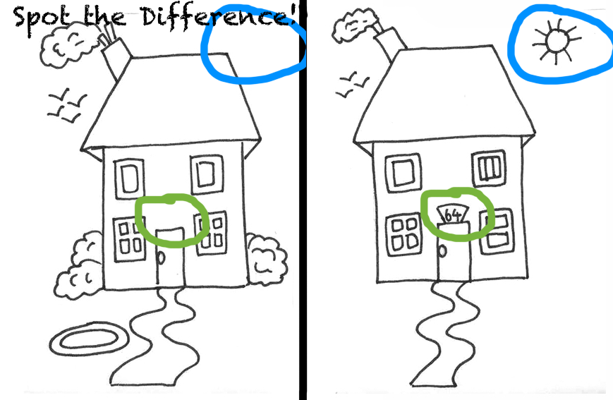
Wha, Wha, Wha, What??? That’s right ladies and gents – compensation isn’t even necessary (in some cases). And, I’m not just referring to the instances where you’re using two colors that don’t even overlap, I’m talking about straight-up FITC and PE off a 488nm laser. Now, before you stop reading and jump over to your Facebook feed let me just assure you that you first learned of the superfluous nature of compensation when you were about 5 years old. You see, analyzing flow cytometry data with or without compensation is nothing more than a simple “spot the difference” game you use to find in the back of the Highlights magazine while waiting to get your annual immunizations from the pediatrician. If you take a look at the figure below you may be able to recognize the left panel as the FMO (Fluorescence Minus One) control and the right panel as the sample. Spot the difference? Instead of seeing the sun missing on the left and then appearing on the right, let’s just substitute a CD8-PE positive population for the sun. It doesn’t really matter if the image is compensated, you’re just comparing the differences between the two.
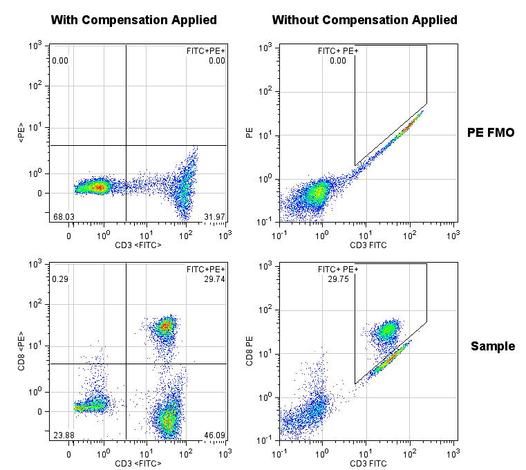
Let’s make the comparison a bit more directly. Here we have some flow cytometry data showing CD3 FITC and CD8 PE. Our goal is to determine what percentage of the cells are CD3+CD8+. Obviously, there’s some overlap in the emission of the FITC fluorescence into the PE channel when run on a standard 488nm laser system with typical filters. If I were to hand you this data set and pose the question of “What’s the % double positive,” you could employ the same strategy used above in the spot the difference cartoon without knowing a thing about compensation. The top two plots below are the FMO controls (in this case, stained with CD3 FITC, but not stained with anything in the PE channel), and the bottom plots are the fully stained sample. In addition, the left column of plots were compensated using the FlowJo Compensation Wizard, and the right column of plots are uncompensated. Were you able to “spot the difference”? If you take a look at the results, you’ll see that either way we come up with the same answer. So what’s the point of compensating?

0 Comments